Canonicals Figma libraries
- Year
- 2024
- Type
- Work Project
TL;DR
Led the rebuilding of Canonical's Figma libraries for a team of 30 designers across 12 product teams. Surveyed the team, wrote a 20-page specification through five collaborative sessions, built 56 components, and created custom metrics tooling to track adoption. 80% adoption in new projects within six months. Released to the Figma community.
The shoemaker’s children have no shoes. At Canonical’s design team, this proverb manifested itself in the Figma libraries. While the team of around 30 designers consistently delivered high-quality designs for diverse products across roughly 12 product teams, the Figma libraries had been neglected. They had become outdated and inefficient. Compared to the codebase they were incomplete, and the existing components were not consistently kept up to date. This led to designers detaching components and creating their own local components and small unofficial libraries, at least five of them, which caused confusion in the handover process.
Taking initiative
The old libraries were not working for me or for most other designers on the team. I initially started building my own local library just to keep up with the pace of design work on the product I was working on. I proposed updating the existing official library, but at the time the need was not recognized by its maintainer.
Eventually management in the design team understood the impact the old libraries were having on team efficiency. I was given the opportunity to lead the effort of creating new libraries from scratch, built around the actual needs of the team.
Understanding the problem
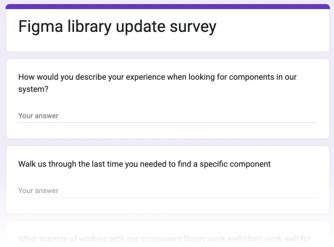
Instead of diving in headfirst, the process started by understanding how the team actually used the libraries and where the problems were. I surveyed how designers use components, gathered feedback on problematic components in the old libraries, and organized meetings with the team to understand their needs.
The survey and feedback revealed a few important things. The biggest frustration was the baseline alignment spacing baked into the old components. Vanilla, Canonical’s CSS framework, implements a baseline alignment mechanism that adds spacing nudges to text. The old library had this built into every component, and it turned out to be one of the biggest drivers of detachment. Designers would detach components just to remove the baseline spacing.
We also found that designers often had trouble finding the component they were looking for because they could not remember the exact name. They would search using synonymous terms and come up empty. This was made worse by the fact that most designers primarily use the assets panel to find components, where search is the main interaction. Both of these findings directly shaped how we built the new libraries.
Research and specification
Library architecture specification
I then did extensive research into best practices for building scalable libraries. I explored approaches from other design teams like Doctolib and articles on library architecture by Nathan Curtis, particularly his concepts on design system tiers and how they could apply to the diverse product ecosystem that Canonical has.
Based on this research and the team’s feedback, I drafted an initial specification and then organized five collaborative writing sessions where the team went through every section together. The result was a 20-page specification covering library architecture, component building guidelines, contribution processes, naming conventions, and component lifecycle management.
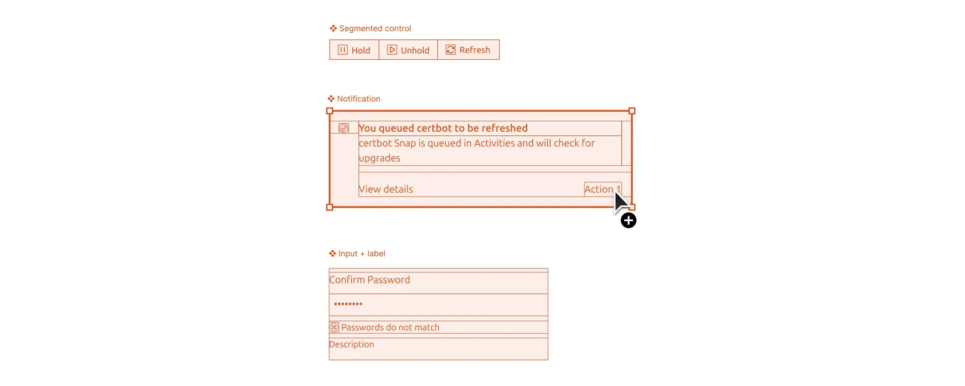
The spec established four library types (Assets, Core Components, Domain Components, Utilities) rather than one monolithic library. It set performance focused rules around layer counts, a soft limit of seven properties per component to avoid overwhelming the properties panel, and a PR-like contribution process where libraries are read-only for the team and changes go through review before a library manager merges and publishes them.
The most contentious discussion was around baseline alignment. Some designers were adamant about maintaining it in Figma. Others, pointing to the detachment data, wanted it gone. The compromise we landed on was a Figma mode where baseline alignment is off by default but can be enabled when needed. This satisfied both camps. We also debated how many libraries to create. There was concern about ending up with too many. The compromise was to co-locate foundational elements like color, type, and spacing with the core components for now, keeping the number of libraries manageable while leaving the door open to separate them later if needed.
Implementation
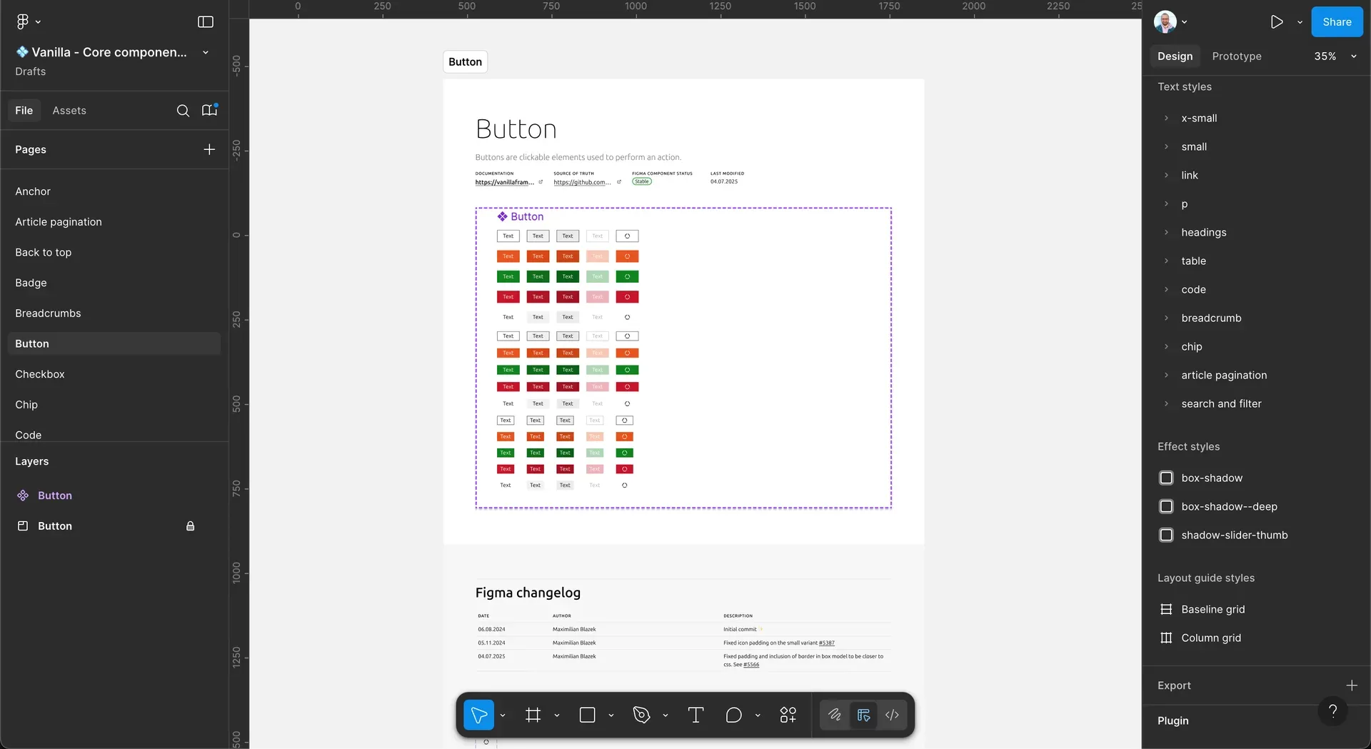
With the specification approved, we moved to implementation. 56 components had to be built. I led the process and personally built the majority of the components, ensuring they followed the performance guidelines we had established around layer count, asset optimization, and effect usage. To address the discoverability problem from the survey, we added keywords to component descriptions so designers searching with synonymous terms would still find what they were looking for. You can read more about the specific building strategies I applied in the blog post I wrote about it.
I worked with one junior designer, letting them take on components they found interesting and could learn from. We did regular reviews to make sure everything stayed consistent with the spec.
Before releasing the libraries more widely, I recognized that better metrics were needed than what Figma natively provides. Figma’s built-in analytics were insufficient for the team’s needs, so I developed a custom metrics tool, taking inspiration from approaches shared by the Pinterest and Uber design teams in their public materials. The tool is a TypeScript script that runs in a GitHub Action, generates a JSON file of library usage data from the Figma REST API (using the tracking pixels baked into each component), and commits it to a repository. A small website then reads this data and displays it as visualizations. This gave us the ability to track component usage frequency, library adoption rates across teams, and most importantly, component detachment rates, which told us which components designers were frequently modifying and therefore needed improvement.
Transition and adoption
After completing the initial library, we announced a six-month transition period during which both the old and new libraries would remain available. Designers were encouraged to start using the new components immediately while being given enough time to adapt. The old libraries were clearly marked as deprecated with notices in file names, page names, component names, and descriptions, along with links to the new libraries.
Throughout this period, the metrics tool provided visibility into adoption patterns. We tracked which teams were switching and talked with designers to understand why some adoptions were slower than others. By the end of the six months, adoption for new projects was around 80%. Some older files, things like updates to previously designed features, still contained old library components. That was expected. Designers were not going to completely rebuild existing files. But we were not too concerned by those stragglers. Adoption in new files was solid, and over time the old components would naturally phase out. The adoption data from the metrics tool also gave us the confidence to deprecate the old libraries without disrupting workflows.
Public release
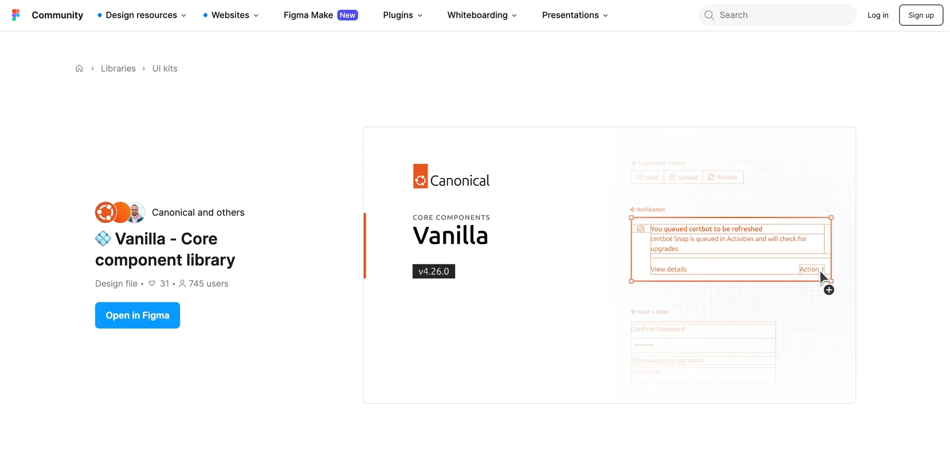
Canonical is an open source company, and sharing comes naturally to us. As a design team we wanted to carry that same openness into our design work. So the plan was always to publish the libraries to the community once they were stable. The core component library and assets library were released to the Figma community.